


One Map to Rule Them All
Maps and who matters

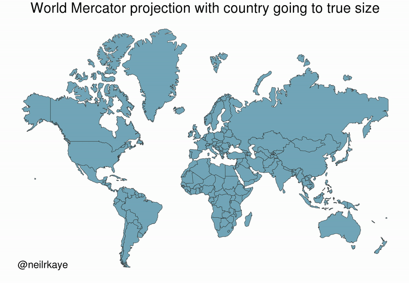
There’s a famous West Wing episode where CJ is first skeptical, then totally convinced, by a group of folks who argue that we need to switch to a more accurate map projection. As a longtime geography nerd, mapmaking + social justice + Aaron Sorkin was a dream crossover, and I’d certainly recommend a good ol’ Peters or Robinson over the dreaded Mercator.
But today, let’s consider an even more radical alternative to either of these maps. Behold, the population cartogram:

Click here for a more zoomable version.
I would love if this were our default map of the world, rather than the land-based physical and political maps that dominate visual representations of Earth.
Every map is a distortion of reality, as every map implicitly privileges certain ways of thinking about and valuing the world. Land-area based maps put geography first. Population cartograms, on the other hand, put people first, representing the distribution of people across political entities.
There’s certainly a time and place for area-based maps; say, when you’re on a boat trying to navigate. But for those times when we’re not steering massive frigates — for those times when we’re making values-based decisions about the world — population-based maps are far more useful.
This map reminds us that roughly a fifth of the world’s population lives in India alone, with another fifth in China. Indeed, more than half of the world’s population lives in Asia. More than half! This map reminds us of the sizeable countries that receive little attention in American news, such as Brazil (211 million) and Pakistan (201 million), and the equally large countries that receive effectively zero coverage, such as Nigeria (196 million), Indonesia (267 million), and Bangladesh (166 million).
The surprise I feel each time I see this map is a reflection of the way in which my attention has been disproportionately drawn to events affecting only a small sliver of the world.
If we truly take seriously that each person is of equal dignity and worth, regardless of who they are and where they live, then we should give our attention and resources commensurate not with geographic proximity, cultural familiarity, or historical norms. We should give our attention and resources commensurate to the number of human souls involved.
Imagine reading a newspaper with articles proportional to the number of people affected. Consider the monumental shift from a focus on the US and Western Europe to one centered on East Asia but encompassing a diverse multiplicity of countries and cultures. Consider also the shift from flashy crises – mass shootings, natural disasters, suicides of celebrities – to massive, ongoing tragedies such as deaths from diarrheal disease (over 1.5 million annually!) and car accidents and heart disease.
Imagining donating to charities aligned with this map: supporting vaccinations in India and those displaced by climate change in Bangladesh rather than merely those closer to home. 95% of US charitable giving goes to people in the US despite having less than 5% of the world’s population, and far less poverty and deprivation than the average country at that.
We live in a world where our time, attention, and resources are distributed unfairly. I’m not saying that looking at this map will fix everything, but it’s certainly a start. Maps are ways of seeing the world; here’s one that offers a truly democratic paradigm.
I know this post is probably a rhetorical tool and not an actual proposal, but this map would be hugely impractical since we would have to e.g. change every map in every classroom every year. As for actual map projections, Robinson is decent, Peters is terrible, but have you seen Kavrayskiy VII? Now that's a tasty map projection.